
Sir Peter Blake @ Cambridge Contemporary Art
JESS MIDDLETON-PUGH takes Peter Blake’s pop art at face value, but can’t help thinking it’s just a bit tired.
Cambridge Contemporary Art, 2nd – 26th June
From the man who brought you The Beatles’ Sgt Pepper album cover, this exhibition presents… more art that looks like album covers.
But this isn’t necessarily a bad thing. Having recently written an essay about pop art, I admit that I initially struggled to look at Peter Blake’s work through neutral eyes. Upon entering the gallery, I found myself wondering whether there is a deeper meaning to Blake’s work; whether he exploits the imagery of popular culture in order to cynically undermine it; or whether he just really likes bright colours.
And then I realised that it really doesn’t matter matter. We are all prone to trying to interpret pop art in bizarre ways, when it really makes a lot more sense to just look at art works at face value. And so I did – no pretentious interpretations; just an honest opinion about what the art looked like.
This collection is fun and cheerful, if not ultimately a little repetitive. A lot of the prints look like birthday cards (particularly prints like I Love You, which states exactly what the title suggests, in gaudy colours.) If you like birthday cards, that’s fine, but I would suggest you make your way over to Scribbler where there is a lot more variety and you can actually buy one for less than £3.
Having said that, you’d struggle to find a picture covered in diamond dust at Scribbler. Pentangle was once such piece. Its sparkly clashing purple, red, and gold made it look a few sequins and a slice of bacon short of the kind of art Lady Gaga might buy. Don’t get me wrong: I don’t mean this as a criticism. Blake explained that he “wanted to make an art that was the visual equivalent of pop music,” and he certainly succeeded. His pieces are undoubtedly suitable for widespread consumption. However, they are sometimes sickly sweet to the point of making your head hurt, and are a prime example of superficial escapism.
Pop art creates visually pleasing works, using images from every day life, borrowing from mass culture to add to ‘high’ culture. Blake’s work is true to this description, but I can’t help but feel it is so ‘pop’ that it has almost become a caricature of itself – a pretty veneer thinly veiling a complete lack of substance.
Blake’s art reminded me of an aging woman, past her prime, who insisted on dressing in the clothes of her youth; in Blake’s case for 50 years too long. I could have stepped into a time warp; commemorative images of celebrities long dead, pictures cut out of vintage magazines, I was almost shocked to find a lack of the now clichéd image of Marilyn Monroe.
Exam term makes people do anything to avoid revision; showering at strange times of the day, obsessive room cleaning, or in my case, visiting art exhibitions. But, I can’t help but think my energy could have been put to better use; I didn’t really gain anything from visiting this gallery. If you’ve already alphabetised your book shelves, re-filed your A level notes, and perfected the art of folding – pop into Cambridge Contemporary Art. But if you miss it, it’s really not the end of the world.
All in all: an inoffensive but ultimately unimaginative exhibition.
Photographs by David Ponting

I have two wives: The seven types of college couples in Cambridge
Only in Cambridge will you hear the words ‘I’m marrying my sister, just makes it easier’ without being worried

Cambridge University college cuts ties with ‘race realist’ philosophy fellow
Emmanuel College has supposedly removed research affiliation with Nathan Cofnas

Review: Squires
From ‘Wouldn’t it be strange if we were ants?’ to ‘Girls are just like the rest of us and not different people!’

Cambridge students occupy King’s Parade with Palestinian solidarity encampment
Demands for support for Palestine were delivered to the university earlier this afternoon

Cambridge college advertise for new housekeepers amid cleaning scandal
Fitz has posted job listings for new housekeeping staff following uproar after cleaners distributed pictures of students’ messy bedrooms

Review: Vignettes from an Inkblot Archipelago
An emotional rollercoaster with a poignant insight into the human experience

Review: The Corpse in the Room
‘If you spend any amount of time with a person, you will form some sort of bond…’


Red paint splattered over Cambridge Labour HQ in pro-Palestine protest
Spray painted nearby were the words ‘Is this really the lesser of two evils?’

Trial resumes for Egyptian agents accused of torturing Cambridge student to death
28-year-old Cambridge PhD Student Guilio Regeni was found dead in Cairo

Cambridge University college returns Aboriginal spears to indigenous Australian community
Trinity returned four spears in a repatriation ceremony to descendants of the La Perouse and Gweagal communities

The Cambridge Union has just released its Easter 2024 term card
The Union could be the surprise highlight of this term


Exam era: Reasons to be optimistic in Cambridge’s Easter term
Easter is a unique term for lots of reasons outside of exams

Deal breaker: The Easter term exam-fuelled breakup phenomenon
What on earth is going on with couples in Cam…

‘Maybe try a different course’: Ranking Cambridge University lecturers’ brutal comments
No wonder Cambridge students always look stressed

Quiz: Find out where you’d sit in the Cambridge University college boat club eight
You go to Cambridge and don’t row? How else do you spend your free time?

Cambridge University college to install climbing wall inside 150 year old church tower
Pembroke has already converted the church on Trumpington Street into an auditorium

Cambridge University to ban use of the term ‘Oxbridge’ due to elitist connotations
Anyone caught using the word will be forced to undertake a mandatory ‘inclusivity training’

St John’s College Cambridge now has control over the SJV choir’s social media
The petition to save the mixed choir is supported by the former archbishop of Canterbury, Rowan Williams

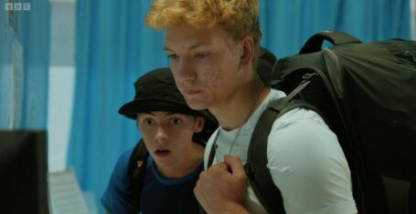
Martha’s arrest and all the other differences in Baby Reindeer from the original play
Netflix also cut out all of the bizarre gifts Martha gave Donny

Romances and trips together: What the Emily in Paris cast have been up to ahead of season four
Desperate to be invited on their group holidays


From Rose Tyler to Ruby Sunday: The definitive ranking of every Doctor Who companion
Criminal that Jackie Tyler has never been on a Tardis trip tbh

Gypsy Rose Blanchard thinks Taylor Swift’s new song Fresh Out The Slammer is about her
She apparently sees a lot of similarities between the song and her life

Richard Gadd says the Baby Reindeer crew was reduced to tears filming harrowing scenes
‘The team felt it with me in a lot of ways’


It’s official: These are the most dangerous Russell Group student areas you can live in
Not a great day to be a Cardiff student

The Tab is hiring a new Staff Writer at its HQ – here’s how to apply
Applications close Sunday 26th May
The competition is really heating up, so when does Race Across The World series four end?
I would be happy only watching this show for the rest of time

Tori and Jack reveal shocking reason why they still haven’t said ‘I love you’ after MAFS
The two have been together for over six months

Book deals and becoming millionaires: The major career moves from the MAFS Australia cast
They really are cashing in on their fame

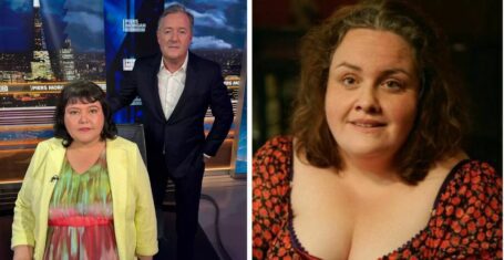
‘I feel a bit used’: What to expect from real-life Martha’s interview with Piers Morgan
She said she chose Piers Morgan’s show ‘because he’s the best of them all’

The shockingly low amount ‘real life Martha’ will be paid for her Baby Reindeer interview
It’s less than you’d expect
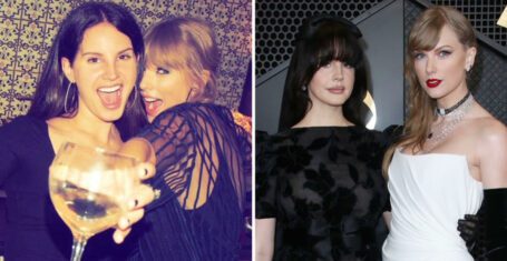
Since it might be on the rocks, here’s a timeline of Taylor Swift and Lana Del Rey’s friendship
‘I’m so lucky to know you and be your friend’

Suing Netflix to Piers Morgan’s show: Everything real Martha has said after Baby Reindeer
She’s determined to ‘set the record straight’

Everyone remain calm, Lucinda from MAFS Australia 2024 is touring the UK in August!
We can all meet the queen herself in person
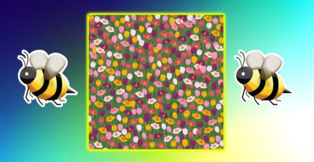
You have 20/20 vision if you can spot the bee in this irritating brainteaser in 26 seconds
Summer is here, and so are the flowery puzzles

Netflix claims it took ‘every precaution possible’ to hide real life Baby Reindeer identities
Netflix had to balance protecting identities with ‘authenticity’

A look inside the Instagrams of the Race Across the World series four cast
Believe it or not, they all do actually have a life outside of the show