There is actually a reason why the ‘N’ is black in the Nutella logo but the rest is red
It’s not just a design choice
Every month, a new post goes viral on Twitter asking why the “N” in the Nutella logo is black, and it turns out, there is actually a reason. So, here’s a deep dive into the history of everyone’s favourite spread.
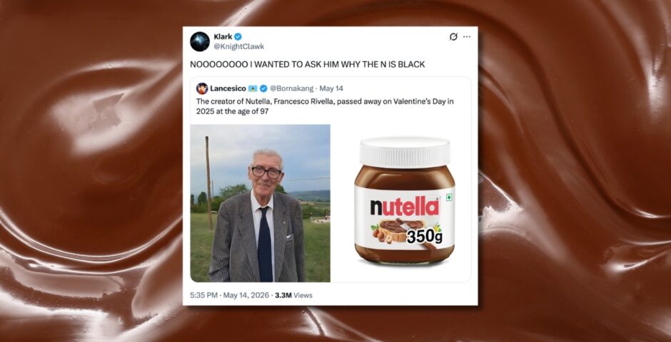
The posts have been circling social media ever since the guy who created the chocolate hazelnut spread as we know and love it, Francesco Rivella, died last year in 2025, and usually say something like: “NOOOOOOOO I WANTED TO ASK HIM WHY THE N IS BLACK.”
It was Michele Ferrero who owned the company, but Francesco Rivella was his right-hand man, and the one who developed the current formula for Nutella. So, what’s the lore behind the logo?
The whole word “Nutella” is written in red apart from the “N”, which is black, and it seems like a bit of an odd design choice. But it all comes down to legal reasons. Here’s a little Nutella history lesson for you.
NOOOOOOOO I WANTED TO ASK HIM WHY THE N IS BLACK https://t.co/onLBi80t0D
— 𝗞lark (@KnightClawk) May 14, 2026
Created in 1946, Nutella was originally called Pasta Gianduja and came as a thick, solid block. Then, it was turned into a creamy, more easily spreadable version called Supercrema in 1951. In 1965, Ferrero decided to change the name of the chocolate hazelnut spread to Nutella, turning it into the product that’s known and loved around the world today.
They made the “N” in the logo black to avoid trademark issues. Basically, there was already a trademark in place for another brand called Nutella with an all-red logo. So to avoid any confusion or legal issues, Fererro decided to make the first letter black and the rest of the word red.
But wait, there was another Nutella that already existed? Well, yes. But it’s not a rare word. The “nut” is for hazelnut, and “ella” is a common Italian suffix that roughly translates to “sweet nut”. So, Nutella could be used for any food product that was sweet and contained nuts.
For more like this – like The Tab on Facebook.
Featured image credit: Twitter

Latest

A group of UoN students created an AI clone of their professor
The professor wanted to test the boundaries of AI
We seriously need to talk about the men on Love Island 2026 because it’s getting uncomfortable

It’s stopped being entertaining and started becoming exhausting
Sam Worthington opens up about the ‘very odd’ reason he cut his own lines in I Will Find You

Not the main character axing his own lines
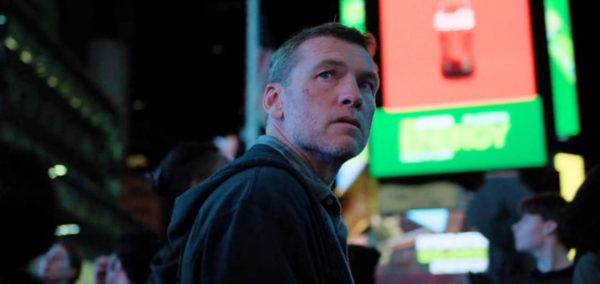
The Times Square scene in I Will Find You has a deeper meaning, but here’s why it almost got cut
The showrunner also revealed why it was perfect for David’s story
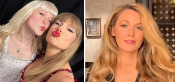
Every celeb we know is going to Taylor Swift’s wedding – and the friends who weren’t invited

I’m personally gutted for Maisie Peters
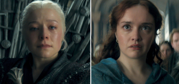
The hidden meaning of Alicent and Rhaenyra’s staring contest, according House of the Dragon stars
I thought they were just serving face
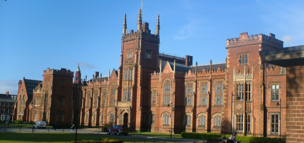
Revealed: Nine Russell Group unis spent on restructuring last year – Queen’s Belfast at £25.4m

Cardiff spent £24.3m on restructuring linked to a voluntary severance scheme despite recording a £33.4m deficit, while 15 Russell Group universities recorded zero restructuring costs in the same year
A rundown of who from Love Island 2026 was scouted, and who applied to be on the show

More applied than I was expecting
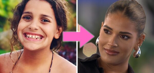
Then and now: Old photos of the Love Island 2026 cast show who’s changed the most

Jasmine has always been a baddie
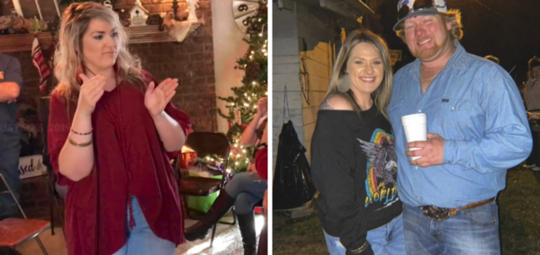
Taylor Parker wrote a grovelling apology letter to ex Wade’s dad from prison after the betrayal
‘Please know that I truly loved Wade as well’
‘She tapped out’: All the NSFW videos from Lily Phillips’ OnlyFans collab with Girthmasterr
‘I did what 100 men couldn’t’
Charleen Murphy’s huge career before Love Island and why everyone is obsessed with her already
She’s too famous for this
The grisly reason Taylor Parker isn’t allowed phone calls or a TV on death row
Other death row prisoners can have these ‘luxuries’


Right, here’s how to fix your iPhone keyboard if it’s glitching and making loads of typos
It’s been happening for months
Taylor Parker’s prison call with daughter reveals first glimpse into her kids’ lives after arrest
Her mum has custody of daughter, and her ex-husband has custody of son
So Bonnie Blue *is* actually pregnant – and now the three possible dads are speaking out
‘She told me there’s a high chance I’m the dad’
Ranked: 15 Russell Group unis by THE sustainability 2026 – Manchester leads, York scores lowest

Manchester topped 1,646 universities globally in the Times Higher Education sustainability rankings
Bonnie Blue drops deranged pregnancy update, says her vile golden baby shower made ‘bump grow’
Don’t read this after eating