
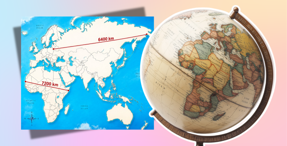
Wait! It turns out the world map we all know is completely wrong, and lowkey racist?
The world map being racist was not on my bingo card
Tell me now, in my 20s, why I’m learning that the world map as we know it is a complete fabrication?
That juicy little tidbit became clear on Twitter when someone rightly pointed out that specific continents were wildly out of scale. For instance, Russia is a behemoth on the map, and Africa is tiny in comparison. In reality, Russia is 6,400 km in width, and Africa is 7,200 km – see what I mean?
Grok was its usual unhelpful self, explaining in the viral post: “Hey kiddo! Imagine our big round Earth like a giant puzzle. This picture has two red lines measuring how wide some land is. The top line is 6400 km across the chilly north lands (like Russia). The bottom line is 7200 km across Africa. Africa is even wider! Maps sometimes make it look smaller, but it’s huge.”
Hey @grok please explain it to me like I’m 5 years old !! pic.twitter.com/0CLaUANFJN
— ᴛᴡᴏ-🆁 (@Be_likeMango) April 30, 2026
The simple answer is that it’s functionally impossible to change a 3D sphere into an accurate 2D rectangle, and while that’s correct, there’s a deeper answer as well.
Why isn’t the world map accurate?
For the most part, most world maps – including Google Maps – are based on this thing called the Mercator Projection. Created in 1569 by cartographer Gerardus Mercator, it was designed with nautical navigation in mind, preserving straight lines and compass directions. It does this by stretching landmasses the further they are from the equator, which is why we get those crazy distortions.
For instance, the world map usually depicts Greenland as a colossal giant compared to Africa, but Africa is actually 14 times larger than Greenland. The same goes for places like Russia, Europe, and Canada, which are presented as much larger than countries like India and Brazil.



There’s also a societal aspect to the world map, and it unwittingly contributes to racist ideals about the Western world. Because the Mercator Projection was designed in 1569, when slavery was still widespread, it perpetuates the idea that the Western world is bigger and better. It really hammers home those colonial talking points.
“Due to the Mercator projection, the Western world continues to believe it’s bigger and better than everyone else, while third world countries are essentially gaslighted into thinking they are smaller than they actually are,” the University of Michigan writes.
Okay, so what map is accurate?
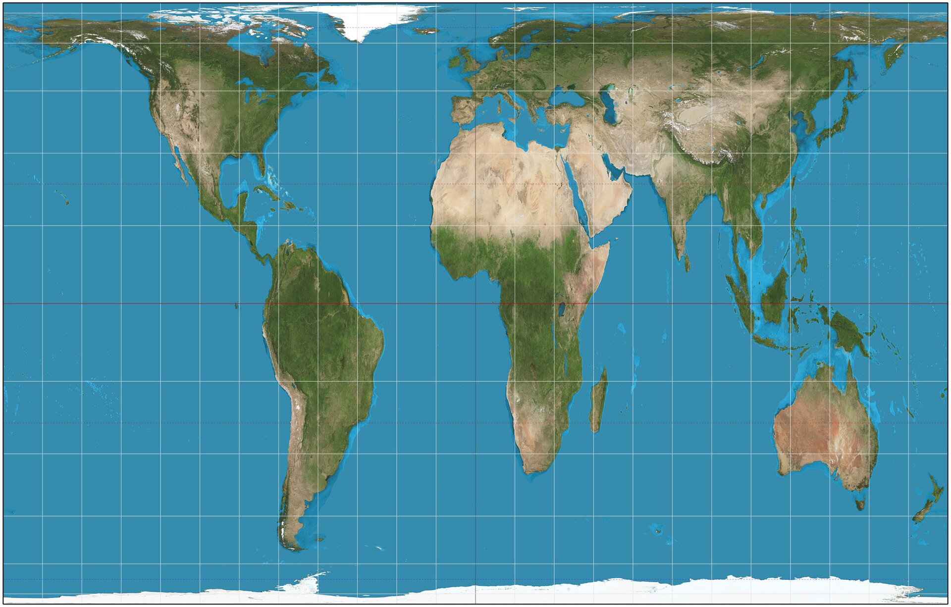
Credit: Wikimedia Commons
Unfortunately, the answer to that question is even more complicated. You see, cartographers, scientists, and other experts have tried to invent new maps for centuries, and each one has its disadvantages.
One example is the Gall-Peters projection, which was made in the 1970s. Though the size comparisons of the countries are more accurate, with Africa rightly taking up the most space, the model made those changes by inaccurately depicting the shape of countries and continents.
It all comes back to one simple fact: The globe is always going to trump a regular map – and it’s more whimsical too.
For more like this, like The Tab on Facebook.
Featured image credit: Twitter/Canva
Latest

All the celebrities publicly calling out Ed Sheeran after Macklemore is dropped from tour

Loads of actors and musicians are speaking out against him

Ed Sheeran branded ‘coward’ as treasure trove of receipts resurfaces after response to Macklemore

Mr ‘I’m not political’ turns out to be very political
HBO casts three more actors in the Harry Potter TV show – here’s what they had to say about it

Moaning Myrtle’s actor understands ‘the significance and responsibilities’

People are just finding out what HYROX really stands for and the backstory is giving them the ick

I don’t know what’s worse, the poop story or this

Love Island couple confirm split as she moves out of home they shared after the villa
This is all so quick!

‘Pull up!’: Video inside NBC helicopter captures final moments and last words of those killed
The helicopter was covering a bus accident when it went down on Tuesday

This Love Island 2026 couple are finally official and the other Islanders are freaking out
Their reactions are brilliant
All three opening acts and Ed Sheeran’s own band quit tour after Macklemore was dropped
‘Artists must not be silenced’

Macklemore’s full ‘Free Palestine’ speech that got him removed from Ed Sheeran’s tour
It was on 4th September

Exclusive: Nee Naw! TikTok icon Nicole Mura is hosting Cardiff Freshers’ Week at Circuit

Hold onto your husbands x

Five things that are actually worth your money as a Liverpool student

Already feeling the financial burden from Freshers’ Week?

Infamous p*rnstar with ‘infinite’ female body count responds after *that* viral gay video
His earlier mission was to sleep with a woman from every country…

There’s a key reason Bonnie Blue was reported to the NSPCC, and not police or social services
People called for her to get ‘locked up’

Three legends are already ‘lined up’ for the next Love Island All Stars and this could save the show
I’m suddenly so invested again
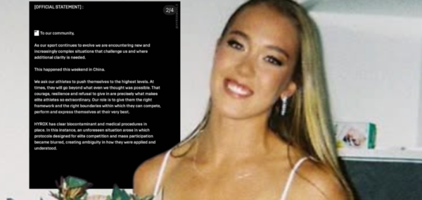
Holy sh*t: The way HYROX responded to poo-gate is insane, so here are the odd statements in full
The founder of HYROX also issued a statement
‘She’s embarrassed of us’: Kelly Osbourne talks about relationship with ‘polar opposite’ sister
‘I don’t want you in my life’

I was an athlete at HYROX event where Joanna Wietrzyk pooped herself – we’re owed compensation
‘No respect for other people’
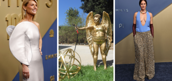
The most out-there outfits that celebrities dared wear to the 2026 Emmy Awards
Wtf was Shailene Woodley in?!
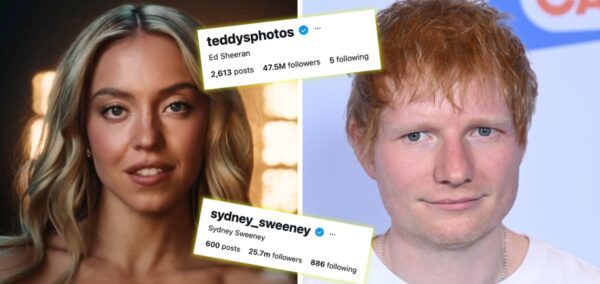
Sydney Sweeney vs Ed Sheeran: Who’s lost more followers after their HUGE controversies this week?
They’re both getting a lot of heat