The five worst iOS 26 features that users are dragging for being ugly, draining and distracting
‘Steve Jobs would have never approved this’
Apple has just rolled out iOS 26, calling it the biggest iPhone software update in years, but many users already regret hitting that download button.
iOS 26 officially launched last week after being unveiled back in June at Apple’s Worldwide Developer Conference. It’s meant to be the company’s most dramatic iPhone update in over a decade. The update brings a completely new look with Apple’s flashy Liquid Glass design and some big new features, but instead of excitement, it has sparked frustration. People online are calling it ugly, annoying, and even “the worst thing Apple has done since iOS 7.”
So, here are the five worst features in iOS 26 that people can’t stop dragging.
1. The battery drain is shocking
My iPhone battery after downloading iOS 26. pic.twitter.com/Zi3W16BFeY
— Austin (@AustinPlanet) September 15, 2025
The number one complaint is how fast iPhones are dying after the update. People say they’re losing 20 per cent of charge in under an hour, with some claiming their overall battery health dropped overnight. Apple insists this is “normal” and just temporary while the phone finishes setting itself up in the background.
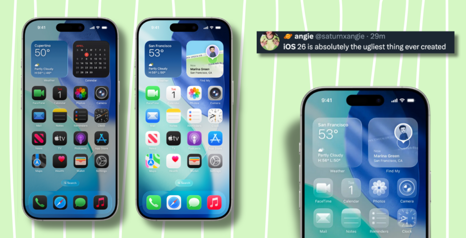
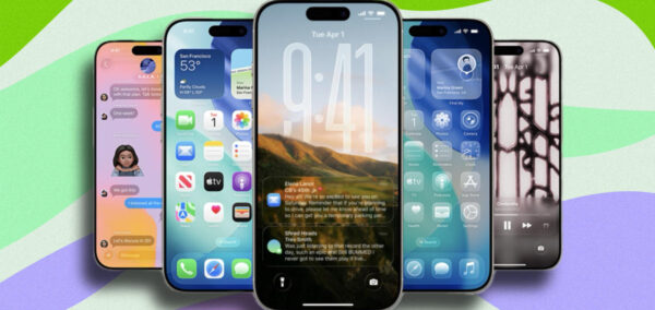
2. The Liquid Glass design is an eyesore
First time I hate the new iOS 26 so much. Everything is wobbly, flashy, distracting. Most of things are unreadable.
Who on Earth decided that switching tabs should be so flashy?? (It is even worse on the device in 120 FPS) pic.twitter.com/7bIgkoxdd9
— Slava Cherk (@SlavaCherk) September 15, 2025
Apple clearly thought its new translucent, frosted-glass look was stylish, but plenty of people hate it. Icons, menus and notifications now look blurry and hard to read, with some users even saying the effect gives them headaches or motion sickness. “Steve Jobs would never have approved this,” one unimpressed user wrote on Reddit.
3. The ‘evil red clock’ is creeping people out


@xompeii iPhones big red clock is a lot less scary when you go into the settings #iphone #iphoneupdate #iphoneclock
One new feature lets your lock screen turn into a digital clock when your phone is on its side. Sounds harmless, right? But when it happens at night, the default bright red numbers glow against a black screen, and people say it looks scary, like something out of a horror film.
4. Dark Mode icons now look… tilted?
iOS 26 is shit.
Everything feels wonky and unreliable. I have black&white filter to reduce the usage of phone, and with it on, it’s not possible to use it after update.
Damn, Apple. pic.twitter.com/oLFtmn1h1u
— Artem 🤙 (@so_weird_guy) September 17, 2025
Dark Mode has also been messed with. App icons now have a soft glow in one corner that makes them look slightly tilted, and people are finding it distracting and even dizzying. To make things worse, switching between Dark and Light Mode is buried behind a long-press “Customise” menu, instead of being easy to toggle in Settings.
5. The keyboard and toggles look wrong
iOS 26:
Clipboard ❌
Better keyboard ❌
Multitasking ❌
Better notifications ❌
Universal back gesture ❌Unreadable ahhh glass design ✅ pic.twitter.com/MsBoK3W4xF
— Noah Cat (@Cartidise) June 9, 2025
Another big gripe is the new keyboard design. It doesn’t even look the same in every app, which makes it feel inconsistent and messy. On top of that, Apple changed the classic round toggle buttons into stretched-out pill shapes, which many say just look cheap and awkward.
For more like this, like The Tab on Facebook. Featured image via Apple.

Latest

Former Lord Provost calls for Glasgow protest ban after counter-demonstrations

Racism must be ‘tackled’ but not at the expense of Glasgow’s cultural reputation, argues Dr Michael Kelly

My Central line tube was evacuated after catching fire – is it time to install AC?

A woman filmed her tube getting evacuated at Shepherd’s Bush station


Where Taylor Parker’s family are now after her horrifying lies destroyed all their lives

Her daughter is doing counselling to help cope with what happened

Explained: The current controversies surrounding Warwickshire council leader George Finch

The 19-year-old Reform politician has faced complaints, an investigation and online scrutiny in recent weeks
Everything you need to know about being that performative England ‘supporter’ during the World Cup

Vindaloo, vindaloo, we’re England, we’re going to drink one more pint than you.

Kylie Jenner sued by ex-chef who says gruelling workload caused heartbreaking miscarriage
‘She experienced extreme physical exhaustion and heaviness throughout her body’

A no-nonsense guide to the best York pubs to watch England bring it home in the World Cup

Aka the best locations to perform your rendition of It’s Coming Home

The bizarre reason Taylor Parker won’t get to choose a last meal on death row

She’ll be given the same food as the other prisoners

Exclusive: Vinted issues statement on human trafficking claims as people spot ‘listings for kids’

‘We are collaborating closely with the competent authorities’

KATSEYE finally address Manon’s future in the group after four months of utter silence
They also explained why they still refer to themselves as a group of six

We now know Zoe Sugg is building a donkey sanctuary during internet break in rogue update
It’s so random but so her
Ranked: Uni courses by financial return – performing arts leaves you £43k poorer than non-grads

A quarter of all UK graduates will be financially worse off over their lifetime than if they hadn’t gone to university, according to new IFS research

A full deep dive into the Premier League footballer Priya dated before Love Island
He’s a pretty big deal n

The queer film you should watch before pride month ends based on your Lancs Uni degree

Because Bottoms is the real education here

Uni of Manchester named most sustainable university in world despite ranking 40th in QS rankings

Manchester’s sustainability impact is ‘truly exceptional’

Netflix’s Unhinged turns your phone into a horror game controller: Here’s how to play

Sadie Sink and Zoë Kravitz star in the interactive game dropping on June 30th

Glasgow uni plans to cut graduate teaching assistant budget by 62 per cent in social sciences

A document seen by The Glasgow Tab revealed GTA funding would drop from £536k to £200k, due to a predicted fall in student numbers

Ranked: All 24 Russell Group unis by endowment income – Oxford at £154m, Cardiff at just £1.4m
Oxford receives over 100 times more in donations and endowment income than Cardiff – and endowments make up more than five per cent of Oxford’s total income, compared to just 0.2 per cent at Cardiff