
We rated the carpets in Exeter’s Wetherspoons, and here’s our verdict
‘I’m sorry, but is this a train seat or a carpet?’
Wetherspoons may not be known for class, but every single pub has it's own unique carpet, and they're pretty cool.
Various people have tried to collect them, and there's even an Instagram and a blog dedicated to them. So what better way to appreciate each Spoons' individual character than having a good long look at their carpets?
We went to each of Exeter's finest drinking establishments and rated their carpets based on colour, pattern, and condition. We even asked fellow pub-goers how they would describe the carpets in one word.
Here's what we had to say:
The Chevalier
"Unloved, disgusting, pukey"

Colour: Wow. Where to begin? The intention was possibly a muted and autumnal vibe, but the effect is an unpleasant mix of browns. Is brown really a colour you want on the floor?
Pattern: It's almost painful to look at. There are so many elements: geometric shapes, spirals, florals, need I go on? There's just too much going on, it looks bedraggled and messy. An unhappy accident.

Condition: Lots of trodden in gum, lots of worn out parts, and a lot of fading and fraying. Various blobs of mayonnaise and other pieces of what we can only hope is food smeared across the floor. Honestly, frightening.
0.5/5
George's Meeting House
"Modern and wavy"

Colour: Good use of primary colours. Not particularly inventive, but not too garish either.
Pattern: Um, I'm sorry, but is this a train seat or a carpet? Try harder next time please.
Condition: Various faded and frayed parts, and some dark patches on the staircase, which we hope are just the remnants of spilt drinks. But nonetheless, relatively clean overall.
2.5/5
The Imperial – Main
"Exquisite and regal"
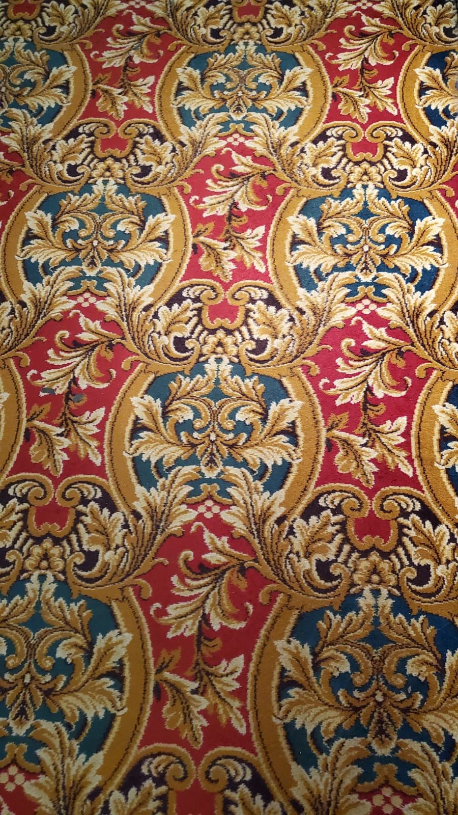
Colour: A carpet of quality! This carpet uses red, teal, and gold to achieve a traditional appearance. Although the colours are not particularly harmonious or pleasing to the eye, they're not ugly or offensive either. In fact, they're almost festive.
Pattern: Traditional floral elements create a hint of regality. The organic leafs make it a little busy and loud, but the golden arcs add continuity and structure. This carpet enriches your drinking experience.
Condition: No fading, no muddy footprints. There are some small worn out patches but the colours remain bright. Some small stains, but overall impressive hygiene and very well maintained.
4/5
The Imperial – Accent
"Simple, ordered, dated"

Colour: Complements the main carpet. Again, not perfect but not ugly either.
Pattern: Simple and continuous. This carpet accents the main carpet well, breaking up its much busier print. The contrast helps it stand out to indicate the walkways through the pub. Not as interesting to look at as the main carpet, but it serves its purpose.
Condition: This carpet is on the landing at the pub's entry and for that reason it is a little more dirty. The rich red ensures it looks bright despite this. A few crumbs and some spilt beer, but nothing too bad.
3.5/5
The Imperial – The Orangery
"Ugly and autumnal"

Colour: Autumnal and warm, but very loud. These colours do not complement each other at all! Who decided orange, yellow and purple was a good idea?
Pattern: In a word, chaotic. There was an attempt at making it look organic, but it's just messy. One pub-goer said: "it reminds me of the garlic carriage in Shrek."
Condition: Quite faded and worn with some fraying and some dirt by the door. Not too shabby.
2/5
The Imperial – Side Room
"Square and frayed"

Colour: Less interesting than the Impy's first two carpets. Traditional and harmonious use of red and gold, but no attempt at including more exciting colours. Nothing to write home about.
Pattern: The gold snowflakes, and white and red detailing, make it a little festive. But there's no border to add extra definition or a pop of colour. Nonetheless, it's a reliable pattern. You know where you're at with this carpet.
Condition: Very faded and worn, lots of fraying at the edges and some splits between panels. Various large dark patches and some stains. Its lack of cleanliness really lets it down.
3/5
The Sawyer's Arms
"Noble and heavenly"
Colour: A rich indigo background with delicate pastels and pink details to complement it, this carpet is a maverick. In a world of red and brown carpets, this one dares to be blue.
Pattern: This carpet accomplishes an organic and delicate pattern that pleases the eye without looking too busy or chaotic. The variety of flowers and leaves gives us plenty to look at.
Condition: A little aged and worn in places. There is some slight fading and fraying, and some splits between panels. This slightly detracts from what is otherwise a very lovely carpet.
4/5
Related stories recommended by this writer:
• A definitive ranking of Exeter’s best pints
• The Old Firehouse is literally the best thing about Exeter
• I ranked every Spoons drink by value for alcohol to save you money

Exeter student threatened with expulsion for saying ‘veganism is wrong’ in own dorm room
Robert Ivinson had a disciplinary hearing after another student overheard his private phone call

The Exeter Tab needs you: Apply to be a part of the 2024-2025 editorial team
Applications close on Tuesday 30th April
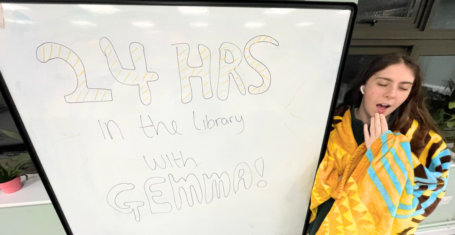
I spent 24 hours in the library during deadline season, and here’s how it went
Spoiler alert: I didn’t write my whole dissertation in a day

Here are the best places for a girls’ holiday based on your Exeter University degree
Who doesn’t want to get away this summer?
10 things which have taken me three years of being an Exeter University student to realise
4. Being more spontaneous

10 things to do as an Exeter student in summer term that aren’t just Exmouth
Because term three has more to offer than Impy and Exmouth

Six things to do in Exeter that are easier than your dissertation or your exam revision
Reading this article counts as procrastination

Search continues for university graduate who went missing after Bristol house party
22-year-old Jack O’Sullivan has now been missing for five weeks

Here are the five types of students you’ll find at an Exeter University lecture
Pret girlies, I’m looking at you

I spent a week romanticising my life as an Exeter Uni student and it was surprisingly fun
Would be on the brink of tears otherwise x

Exeter University bans Sambas from Students’ Guild calling loose shoelaces a safety hazard
SU staff and security will check every students’ footwear on entry

Here is what every Exeter University hall would be as a classic Easter egg
Holland Hall’s egg is definitely not found in Tesco

Fridays with Edie: Why it’s ok to feel scared about graduating university
I’m not ready to talk about it x


Here are six expectation vs reality moments we all have as Exeter University students
Don’t say we didn’t warn you

Here’s a rundown of the best happy hours for Exeter University students
Because poor decisions lead to the happiest of hours x

University of Exeter warns students over ‘contaminated’ heroin as drug overdoses rise in area
The university has since faced criticism for advising safe drug practices instead of exclusively condemning use

‘The campus cat’: Here’s seven things that Exeter Uni students love most about the city
The independent coffee shops are also a big hit

Inside Sara and Lauren’s adorable friendship after meeting on MAFS Australia 2024
Best thing to come out of MAFS tbh

Selling Sunset’s Bre sued for over $12million by previous employees over ‘vulgar behaviour’
In the lawsuit she’s been accused of homophobia and threatening violence

From sparkly bows to black spikes: Inside JoJo Siwa’s generation defining life
She did indeed come back like a Boomerang

From architects to models: All the new partners of the MAFS Australia 2024 cast members
They look so much happier!

Explaining the completely bizarre and violent ending of Love Lies Bleeding
I support lesbian rights AND lesbian wrongs!

The MAFS Australia 2024 cast members who are still beefing, even now the show is over
They really won’t ever rest

Lawyer reveals the Baby Reindeer scenes Netflix should have cut to keep Martha anonymous
‘What Richard Gadd has done is very high risk’

Ellie reveals shocking axed insults that made her swear at Sara at MAFS Australia reunion
I can see why she lost her cool

Tears and walk outs: All the dramatic scenes cut from the MAFS Australia 2024 reunion
We were robbed of SO much chaos

Six months after the MAFS Australia 2024 reunion, have Jack and Tori said ‘I love you’ yet?
The all important question

Inside the controversial Serena Williams tennis match that inspired the film Challengers
‘What if you really needed to talk about something? And what if it was something going on beyond tennis?’

Omg, Tim wishes he had quit MAFS Australia 2024 and ‘regrets’ not walking off the show
And thought the show was ‘messed up’

MAFS Australia’s Jack and Tori have ranted about their co-stars on their secret Instagram
‘We honestly couldn’t give a f*ck’

There was massive cast drama surrounding the pronunciation of Sara’s name on MAFS Australia
Tim revealed how it ‘blew out of proportion’

Meet the full glam cast of Buying London, Netflix’s new UK Selling Sunset style show
It’s coming later this month!

‘It’s wrecked my week’: Real life Martha ‘targeted by cult’ following Baby Reindeer on Netflix
‘They are determined to stalk me the same way I am stalking them’

Tori’s bestie from the MAFS Australia wedding now thinks her and Jack are ‘so compatible’
Changed her tune since she was a bridesmaid I see

Tori declares ‘good riddance’ to rest of MAFS Australia 2024 cast in savage Instagram post
Looks like she won’t be seeing any of them again in a hurry

Um, Jayden made Lauren cry and she stormed out the MAFS Australia 2024 reunion?!
Production had to step in and have a word with Jayden, but all of this was cut from the show

You have 20/20 vision if you can find the cat in this optical illusion in five seconds
Anyone else now craving ice cream?

Memes, streams, popstar of dreams: How Sabrina Carpenter’s Espresso took over the world
Me 80 times a day: ‘I’m working late, ’cause I’m a singer’