
Judging Books by their Covers
You probably can’t be arsed to read books so we can’t be arsed to review them properly.
You want book reviews? Seriously?! The life of a Cambridge student is fraught enough without having to write book reviews. Getting up for lectures, handing in essays and dodging through the various social engagements that university throws at you is hard enough without ploughing through 400 page tomes in order to write a 500 word article! No, student life leaves no time for writing book reviews, reading book reviews or, indeed, reading any title that isn’t on your reading list. And yet, the book trade in Cambridge is practically booming. Sometimes it seems that every second shop is a bookshop and the city has huge branches of Waterstones, Boarders and even an insidiously disguised Blackwells. Why is it than, that with so little time and so many other distractions, books continue to fly off the shelves?
The answer of course, is that books furnish a room like nothing. They make standard issue college digs look lived in and they make you look thoughtful, intelligent and intellectual. A well-placed copy of Proust (or, for the less sophisticated amongst you, Clarkson) can have the aphrodisiacal effects of an oyster dinner (or, for the less sophisticated amongst you, rohypnol) and propping your laptop up with that vintage hardback edition of War and Peace adds at least ten points to your perceived I.Q. despite the fact you haven’t got past chapter one…. Yet…
So, like any piece of interior decoration, what really matters about books is not what’s in them but what they look like. Fear not, young faux intellectual, for here at the Tab we judge those latest releases by the only standard that really matters. We judge books by their front covers!
The Lost Symbol – Dan Brown

Dan Brown’s books have sold into the millions spawning rip-offs, films and vast stinking piles of filthy lucre as they went. Sadly, the cover of The Lost Symbol matches the content of a typical Dan Brown novel- drab, brown and cliché. For what I can only guess is the tale of a missing percussive instrument, Dan’s publisher’s have chosen a clean and acceptable cover, as far as covers go, with a gloomy picture of capital hill and an image of a mysterious key as well as some shiny though notably insipid golden text. In fact, it perfectly sets the tone for the rest of the novel- gripping, eye catching and utterly uninspired!
3 Stars
The Scarpetta Factor – Patrick Cornwell
Beyond being by the supposed “world’s number one thriller writer”, I’ve absolutely no idea what the Scarpetta Factor is. An arcane alchemical? A useless equation? The latest Boots own brand eye liner? It’s a mystery! The true nature of the Scarpetta Factor matters little, however, because the front cover is splendid. An elegant duotone with a picture of a red neckerchief, tastefully placed onto a silky smooth white background. But why is the cloth red? Could it be blood? Is it just a red neckerchief? I have no absolutely no idea!!! It’s mysterious, it’s thrilling, it’s elegant and it’s hardback. Who cares about the content, this is what I need to furnish my studential hovel!
4 stars
And Another Thing – Eoin Colfer
Another Hitchhikers guide book by someone other than our own Douglas Adams? Sacrilege, I hear you cry. “They didn’t write a Catch 23” I hear you mutter under your collected breaths. Well… actually…. There was a sequel to Catch 22, but that aside, what of And Another Thing’s cover? It’s cluttered, sure, and it breaks the “no more than two fonts” rule. And it’s loud. And, ok, it’s slightly ugly. But, on the other hand, it’s eye-catching, intriguing and vaguely amusing. For a book that should never have been written, the cover isn’t half bad.
…I guess.
3 ½ stars
Alex Cross's Trial – James Patterson (…& Richard Diallo)
It doesn’t matter that James Patterson is the world’s best selling thriller writer. It doesn’t matter that “In a fight for justice, one man must make the ultimate sacrifice”, this style of front cover was not acceptable since soviet Russia. A tasteless splattering of red fading to orange which looks like it was achieved with the MS Word fill effects tool. The noose may well have been dragged from the clip art library of that same program and not only is the font sans serif it’s sans taste! The co-author Richard Dilallo is blatantly sidelined and the shade of red chosen for his name clashes almost perfectly with the shade of red on the top half of the cover. Alex Cross’s Trial is a complete travesty of cover design! “The world’s best selling thriller writer" should have taken a leaf from the book of ‘The world’s number one thriller writer” and added a bit of that Scarpetta Factor.
1 Star
Songs of the dying earth – George R.R. Martin & Gardner Dozios Eds
Songs of the dying earth looks pretentious as a book can be and that, let’s face it, is exactly what a Cambridge student should want! The cover is a near carbon copy of Coldplay’s album Parachutes and very subtly depicts the dying sun as it finally engulfs the earth. I’ve no idea why the earth, at this juncture, would be singing. Maybe it’s a metaphor? It matters not because this is exactly what front covers should look like. Tasteful, subtle, uncluttered, glossy and delicious. It’s amazing what you can do with two colours and one circle! This motif is so good, in fact, that it’s already been used to brand Coldplay, late 20th century Japan and even the moon.
5 Stars

Cambridge college advertise for new housekeepers amid cleaning scandal
Fitz has posted job listings for new housekeeping staff following uproar after cleaners distributed pictures of students’ messy bedrooms

Review: Vignettes from an Inkblot Archipelago
An emotional rollercoaster with a poignant insight into the human experience

Review: The Corpse in the Room
‘If you spend any amount of time with a person, you will form some sort of bond…’


Red paint splattered over Cambridge Labour HQ in pro-Palestine protest
Spray painted nearby were the words ‘Is this really the lesser of two evils?’

Trial resumes for Egyptian agents accused of torturing Cambridge student to death
28-year-old Cambridge PhD Student Guilio Regeni was found dead in Cairo

Cambridge University college returns Aboriginal spears to indigenous Australian community
Trinity returned four spears in a repatriation ceremony to descendants of the La Perouse and Gweagal communities

Cambridge college cuts ties with ‘race realist’ philosophy fellow
Emmanuel College has supposedly removed research affiliation with Nathan Cofnas

The Cambridge Union has just released its Easter 2024 term card
The Union could be the surprise highlight of this term


Exam era: Reasons to be optimistic in Cambridge’s Easter term
Easter is a unique term for lots of reasons outside of exams

Deal breaker: The Easter term exam-fuelled breakup phenomenon
What on earth is going on with couples in Cam…

‘Maybe try a different course’: Ranking Cambridge University lecturers’ brutal comments
No wonder Cambridge students always look stressed

Quiz: Find out where you’d sit in the Cambridge University college boat club eight
You go to Cambridge and don’t row? How else do you spend your free time?

Cambridge University college to install climbing wall inside 150 year old church tower
Pembroke has already converted the church on Trumpington Street into an auditorium

Cambridge University to ban use of the term ‘Oxbridge’ due to elitist connotations
Anyone caught using the word will be forced to undertake a mandatory ‘inclusivity training’

St John’s College Cambridge now has control over the SJV choir’s social media
The petition to save the mixed choir is supported by the former archbishop of Canterbury, Rowan Williams

Cambridge University temporarily halts funding from fossil fuel companies
A report found that donations from oil and gas companies posed a ‘high reputational risk’ for the university

Eight cafés to try in Cambridge as a student before you graduate from university
Spoiler alert: Fitzbillies isn’t the only coffee shop in Cambridge

St John’s College Cambridge mixed choir is being disbanded
The decision means female sopranos will no longer be able to sing in any chapel services
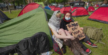
All the large-scale encampments happening at UK university campuses right now
The protestors plan to stay ‘indefinitely’ or until their demands are met

Richard Gadd has revealed which ‘disturbing’ Baby Reindeer scene was the most truthful
The scene was incredibly harrowing

The most terrifying episodes of Buffy that prove it used to be the scariest show on TV
Get that skin eating monster away from me

Ranked: Who from MAFS Australia 2024 gained the most Instagram followers on the show
This is what they really came for

Tim completely ‘cut off’ from media opportunities by MAFS producers after breaking contract
Executives of the show were ‘furious’ with Tim

Deleted scenes and alternate scripts: The biggest production secrets from Baby Reindeer
There’s a lot of truth being revealed

So after all the drama, who from MAFS Australia 2024 is actually still mates?
Lucinda is a common feature, of course

All the shows with 100 per cent Rotten Tomatoes ratings you need to watch after Baby Reindeer
Binged the entirety of Baby Reindeer in one day? I’ve got more for you


A release day ranking of Dua Lipa’s disappointing new album Radical Optimism
Inspired by Britpop and 90s rave culture? Where?

Baby Reindeer creator Richard Gadd is a secret millionaire raking in even more from Netflix
Umm, he has a whole other name he makes money under?
Richard Gadd reveals the reason why he banned his parents from watching Baby Reindeer
It’s absolutely heartbreaking


A rundown of all the drama between Selling The OC’s Tyler and Alex Hall and Brittany Snow
Brittany hinted Tyler was unfaithful during their marriage but Alex has snapped back

Every time the outspoken MAFS Australia 2024 cast savagely slammed the show’s producers
They have not held back at all

Ranking The Real Housewives cast by the whopping amount they’ve spent on plastic surgery
I’ve never felt so poor


Camden pubs to comedy clubs: All of the real-life locations used for filming Baby Reindeer
Probably best to avoid some of these locations

Three MAFS Australia 2024 cast members wanted to quit but stayed until the end of the show
Producers persuaded some to stay whilst others have said they still regret not leaving
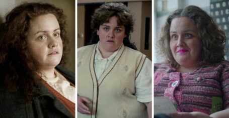
Here’s where to watch Jess Gunning next if you loved her in Netflix’s Baby Reindeer
She has ironically played many police officers

You need to watch the explosive new dating show Love Triangle that makes MAFS look tame
It’s got dinner parties, arguments and cheating scandals in the first two episodes!