Obnoxious, clunky and awkward: These are officially the UK’s ugliest university buildings
We need to fund more architecture degrees
Universities in the UK are known for their beautiful campuses, dotted with buildings that could look anywhere between futuristic and something out of Hogwarts. And then there are some buildings that look like they’re straight out of your art class from year two. And let’s be honest, unless you were a young Gehry or Hadid those designs were not looking good. Let’s revisit the old drawing board and take a look at some of the ugliest uni buildings across the UK in 2023 that were definitely outsourced to overworked six-year-old “artists”.
These are officially the ugliest UK uni buildings in 2023:
Opal Court student housing – University of Leicester

via Google Maps
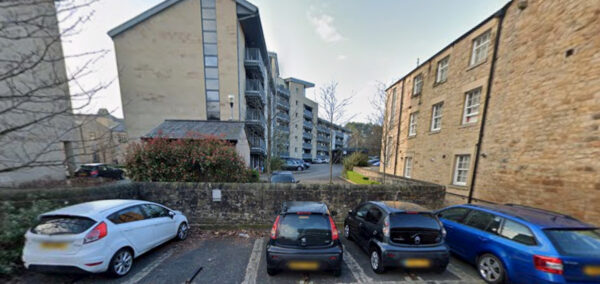
Opal Court student housing at Leicester Uni is one of the prestigious winners of the Carbuncle Cup. If you have no idea what that is I don’t blame you – it’s an annual architectural prize given out by Building Design magazine for “the ugliest building in the United Kingdom completed in the last 12 months.” Yes, in 2007 Opal Court literally won an award for being the ugliest building that year. Need I say anymore?
The Diamond – University of Sheffield

via Google Maps
Born out of the current school of facadism, The Diamond boasts the famous design of making a big box and sticking stupid stuff on it. Home to Sheffield’s engineering department, this £81m public affront was also nominated for the Carbuncle Cup in 2016. Diamonds are forever but my patience with this building is far shorter.
Fogg Building – Queen Mary University London

via Google Maps
Green and black are just not good colours for buildings. Queen Mary’s clunky, XBOX colour scheme, building is home to its bioscience and psychology departments. If, for some reason, you wanted to go to a uni building that looks like it’s made of off brand Legos then this is your building.
Students’ Union – Sheffield Hallam University

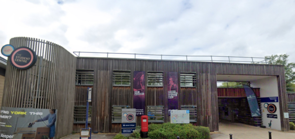
Previously the National Centre for Popular Music, the Sheffield Hallam Student’s Union is just odd. There are just so many things I could compare this to but the only thing in my mind right now is curling.
Physics Tower – University of Exeter

via Google Maps
Exeter’s physics building looks like when you leave something on the edge of a table and it gives you anxiety that it’s going to fall and break. Aside from being a brutalist nightmare, the only thing the Physics Building gives me is that very same anxiety. Although, if my worst fears do come true and it does fall off the edge, at least it’ll take all the physicists with it.
Broadcasting Place – Leeds Beckett University

via Google Maps
The Broadcasting Place building simply reminds me of Jenga. But you’re drunk. Like really drunk. So drunk in fact, that the literal Jenga tower transforms into Broadcasting Place and you are most definitely about to lose the game. I suspect that was the story of how the architects came up with this design.
Southend-On-Sea – University of Essex

via Google Maps
The reocurring theme of these buildings looking like poorly knocked-off games has to say something about the creativity of these designers. We’ve had Jenga and Lego so let me introduce you to Tetris building. And to make matters worse, it’s so offensively colourful that there is literally no way it fits in with the rest of the area. It also has three clocks on the side of it thrown in for good measure – what were the architects smoking?
Central Hall – University of York

In what can only be described as something that has flown out of a poorly produced sci-fi movie from the 1960s, every fact that you learn about this building is as insane as it is ugly. Firstly, Central Hall is situated at Scullion’s Lake, the largest plastic-bottomed lake in Europe. Secondly, all of the York uni students are cursed to graduate here. And finally, apparently, regular movie viewings (including a recent viewing of Ratatouille) take place in this building. Genuinely what is happening in York?
International House – University of Nottingham

via Google Maps
International House simply took every wrong turn during its design process. They picked the red, they picked pointy, and they picked awkwardly placed. International House has been described as an example of Digital Architecture, expressing the use and influence of modern technology in physical form. I think the designers needed to take a break from technology and rethink why their building looked like a broken tooth kicked out of a rugby lad’s mouth.
Humanities Building – University of Warwick

It’s just so grim…
Have you started uni this year? Follow us on Instagram @thetab_ for all your uni’s gossip, news and top memes.
Related stories recommended by this writer:
• Get that bag: These are the universities churning out the most CEOs in 2023
• These are the best unis for every single subject, according to The Times Good Uni Guide
• These 11 UK universities just got recognised as some of the best on the planet
Featured images before edits via Google Maps.


