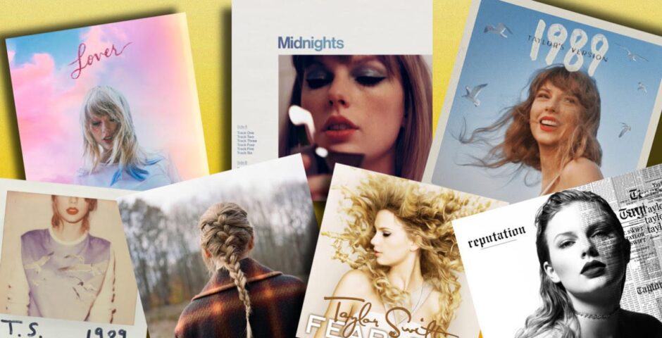
The definitive ranking of every Taylor Swift album cover
The Folklore forest is my safe space
1989 (Taylor’s Version) is literally around the corner, and with its announcement came a brand new album cover that fans have honestly been split over. 1989 (Taylor’s Version) takes the grand total of main album covers to a grand total of 16 – each with varying level of quality and merit. Truly, all of life is here. Taylor Swift is almost always consistently excellent in her musical output, but her choice of album covers is way more of a mixed bag – with that in mind, let’s get them ranked from worst to best.
16. The Taylor Swift Holiday Collection

Unforgivably traumatic. Krampus.
15. Fearless

Just an overwhelming amount of wind. I feel like I’m in a hurricane every time I look at it. I feel like it’s taking every ounce of energy in her body to look demure here when really she feels like a piece of washing in a tornado.
14. Speak Now (Taylor’s Version)

Just… not a very good photograph. Where’s the youthful magic, the Disney-esque prom night vigour that courses through Speak Now? Of all the Taylor Swift album covers ranked here, the way I felt when I saw this was the most disappointed.
13. Speak Now

With all my misery and slander of Speak Now TV’s cover, please don’t think that means I love the original much either. Can’t stand the font and the dress is, to be blunt, ugly. When Aretha famously said “Great gowns, beautiful gowns” when asked what she thought of Taylor Swift, I know for a FACT she wasn’t thinking of this one.
12. Taylor Swift

Awful and iconic in equal measure. It’s a ridiculous image but one I’ll be quite sad to see the back of when we get debut’s rerecording. For all its flaws, it still pleases me. The hair is so wild – she’s giving a cross between Nickelodeon’s H2O Just Add Water and Sims 4’s mermaids. The brightening of the eyes so hard she looks like a Game of Thrones White Walker and the Buffy DVD boxset pattern on the left side… Just comedy.
11. Red

She looks like Puss in Boots when King Harold approaches him in the Poison Apple to hire him to assassinate Shrek. Could be worse though – she could have forced us to endure some geek glasses and some brogue shoes.
10. Reputation

There’s a great idea here that’s completely ruined by a Forever 21 jumper that feels like an afterthought, and the text placement is the definition of “graphic design is my passion!” I still kind of like it, but cannot WAIT for Taylor’s Version to knock it into next week.
9. Evermore

Do love, but you’re the biggest artist in the world and I could take this in my back yard in 30 seconds.
8. 1989 (Taylor’s Version)

A polarising one, and it feels correct that it’s coming bang in the middle of Taylor Swift album covers ranked. I wish it had no text like the rest of the Taylor’s Versions, and I wish it was the picture as a polaroid like the original cover. On the wow side, she looks so happy here that the picture just radiates joy, and the gulls from her jumper in the original version now flying above her is a great touch.

7. Lover

Of all her albums, Lover’s album cover looks exactly like the record sounds. I look at this and I can feel all the colours that I hear from its tracks. The synergy there pleases me.
6. Fearless (International Version)

Way better than the American Fearless release. You guys were done dirty with the wind machine attack. This is actually the first Taylor Swift album cover I ever saw, circa Love Story coming out. I think it sums up the album perfectly and has so much more life than the other version! I’ve not included other deluxe version edits on this list or anything, but this one is a completely new image and deserved to be talked about in its own right in my opinion.
5. Fearless (Taylor’s Version)

Besides the fact she’s dressed like she’s about to burn me to death inside a wicker man, the first glimpse the world got at a Taylor’s Version album cover understood the assignment. The wind looks natural, the pose looks euphoric and the brown feels warm and gentle rather than muted and dull. Great stuff.
4. Red (Taylor’s Version)

Just feels… perfect. It feels like everything the album represents whilst also being a perfect encapsulation of who Taylor Swift is now and her growth as an artist and cultural figure. Also the most autumnal vibe ever. Cherish.
3. Midnights

Old fashioned, 70s esque vinyl aesthetic conjuring up moody flames and pop magic. Perfect. Just feels correct. Don’t like the Til Dawn variation though because it looks exactly like my Apple weather widget when the sun sets and it throws me right off.
2. 1989

A bit of a modern classic. In every sense of the word!
1. Folklore

There’s just something majestic about Folklore. It feels so vast and endless, whilst also managing to feel cosy – like it’s a place you’ve come to all your life. I like to think that Taylor being small in the image compared to the woods links with how this is her first album where she’s truly storytelling rather than writing about her own experiences. It’s not about her, but the wider world. Beautiful.
For all the latest music and entertainment news and gossip, like Pop Culture Shrine on Facebook.
Related stories recommended by this writer:
• Ranking every song on 1989 by Taylor Swift, in honour of the Taylor’s Version announcement
• A logical guide to all the 2023 Love Islanders as Taylor Swift albums
• Every Taylor Swift single painstakingly ranked from worst to best
Latest
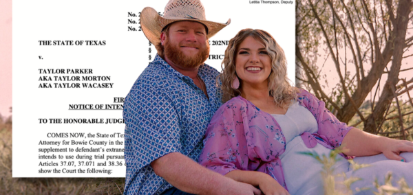
The horrific list of Taylor Parker’s further criminal activity that Maternal Instinct missed out

From fraud to murder plots

Maternal Instinct director reveals why she chose not to interview Taylor Parker in prison

They didn’t want her in the documentary
Wow, Taylor Parker has finally admitted what ‘really happened’ with Reagan Simmons

She went into graphic detail in her confession
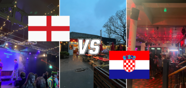
All the best spots in Leeds to watch England in the World Cup

For the self-proclaimed football ‘experts’ and novices alike

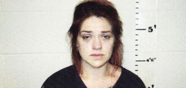
When Taylor Parker’s execution date will be and why she won’t get a last death row meal
She’s currently behind bars in Texas

Prosecutor reveals how Maternal Instincts’ Taylor Parker kept lying about medical issues in jail

‘She’s playing the victim’
Choose your winner! It’s time for the final round of Lancaster’s BNOC competition 2026

With a combined 1,895 votes across all phases, we have reached the final three
Videos resurface of Brazilian bungee instructor’s dangerous stunts before fatal jump arrest
The video captions have a different meaning now
‘She trapped us’: Passengers on delayed flight held captive by influencer’s ‘rude’ speech
She’s added some context, but people are still angry

Bungee jumper says it was an ‘unusual day’ with ‘long delays’ when woman tragically died
He jumped off the same bridge hours before her

What happens to students if their university closes – and why protections are ‘inadequate’

If your university closes mid-year, there is currently no guarantee you could finish your degree, and international students could lose their visa status entirely

Bonnie Blue rips into Love Island’s Jasmine calling her a ‘hypocrite’ in deeply personal spat
‘Lorenzo is far too good for you. Ask me how I know’
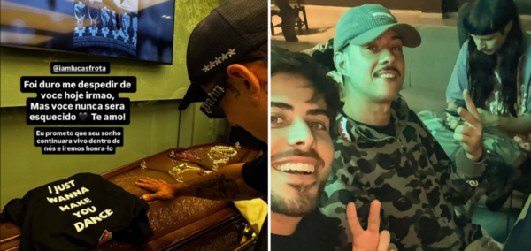
‘I was meant to be with you’: Sole survivor of crash that killed Oliver Tree speaks out
‘I will always remember you’

Chris Watts had another secret lover and she’s sharing all about their ‘unsettling’ encounter
There’s evidence of a third woman, too

Police share dark insight into the cause behind helicopter crash that killed Oliver Tree
Officials are investigating two possible causes
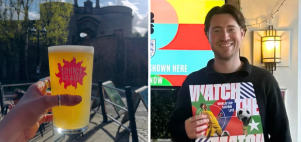
All the Nottingham venues where you can watch England in the World Cup

Soak in the action, despite the timezones
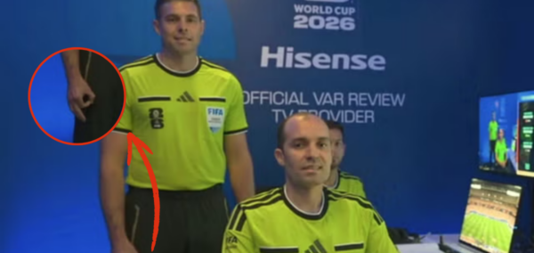
World Cup referee accused of making ‘white power’ gesture speaks out as FIFA reaches verdict
‘The Disciplinary Committee has also taken note of Mr Evans’ statement’
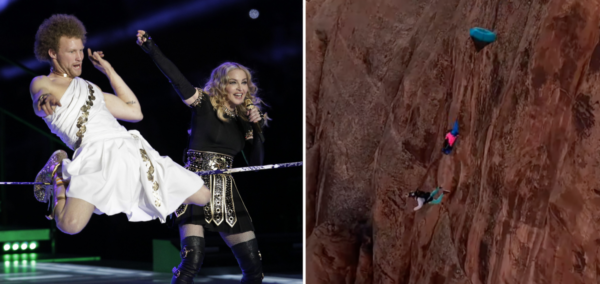
Daredevil who performed with Madonna dies in awful tandem BASE jumping accident
A 50-year-old man also died