

Here’s why Instagram changed its word logo after 10 years, as people say it’s ‘hideous’
It looks like it says ‘Instagzam’
Instagram just unveiled a brand new wordmark logo and people are absolutely rinsing the “terrible” new design online, but here’s why they made the change.
It’s not the app logo that’s changed. That’s still the same camera icon with the pink, orange and purple gradient. It’s the way Instagram is written as a full word.
For a whole decade, the word “Instagram” has been written in a cursive handwriting font that everyone knew and loved. Yes, it was a little bit dated, but it felt nostalgic. Why change something that’s not broken?
Marking its first change since 2016, the new word logo is still in a script font, but some letters are weirdly joined while others aren’t. The “R” looks like a “Z” too, so it reads like “Instagzam”. How did nobody on the design team notice that?!
Everyone hates it. “Instagram, did you use AI to make up this new logo? Because wtf is this… the old one was fine,” one person said. Another agreed: “Instagram’s new logo is absolutely hideous.”
Instagram just updated their in-app branding and good god it’s ugly 🤢 pic.twitter.com/SuJHHCnIVW
— Robert 🤘🏼🇺🇸🦅 (@realrobertherr) August 14, 2026
So, why did Instagram change its word logo after 10 years?
Apparently, the new logo is more “modern” and “carries the brand into the future”. More modern? I guess so. Prettier? Hell no.

“The wordmark at the top of the app hasn’t changed in 10 years, so it was time for a refresh,” Instagram head Adam Mosseri said. “Cleaner and more modern, with references to the original and the simplicity and craft that’s always made it Instagram.”
Meta added in a press release: “Our new wordmark elevates simplicity, creativity and connection. It was important to craft a mark that still makes Instagram feel like Instagram, while introducing something to carry us into the future.”
View this post on Instagram
“The team explored hundreds of directions: from all-caps, to camera concepts, to literal handwriting. We kept coming back to what’s always been special about Instagram: the magic of crafted script. It modernises the brand while keeping that warmth; our hope is that it feels personal, confident and unique.”
Jasmine Probst, Director of Product Design at Instagram, also said: “Script reflects individuality, so referencing that felt right. The new wordmark is bolder and simpler, with touches of unexpectedness. It cues individual expression, a personal voice, both of which have always been core to Instagram.”
The new logo is already appearing at the top of everyone’s Instagram feeds. It’s so ugly.
For more like this, like The Tab on Facebook.
Featured image credit: Meta

Latest
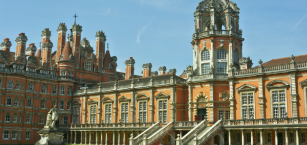
London university releases statement after professor sentenced for a child sexual offence

Barry Langford was a Professor of Film Studies at Royal Holloway

Young father-of-two died on day he was due to start at University of Glasgow

Young father tragically passes away at 24 years old after suffering a brain aneurysm
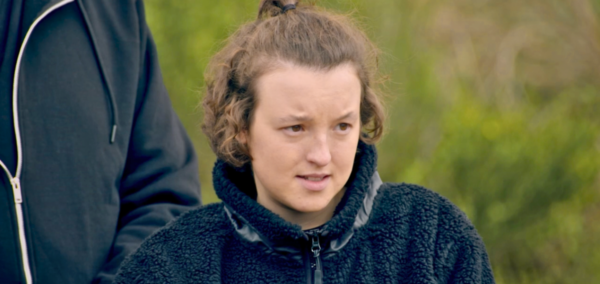
Bella Ramsey’s specific acting career gives them ‘an edge’ on Celebrity Traitors (they hope)
Their past roles have prepped them for Missions
12 of The Celebrity Traitors season two cast asked to be Traitors, and six to be Faithfuls
Three celebs couldn’t make up their minds
Maya Jama’s game plan for Celebrity Traitors is to avoid trying ‘too hard’ or ‘overthinking’
This is really devious tbh

Newcastle University buildings evacuated after ‘suspicious item’ found on campus

Police, fire crews, and fire engines arrived at the scene
12 things every Fresher gets wrong in their first few weeks at uni

From wearing your lanyard everywhere to leaving your washing-up until it grows its own ecosystem

Our Celebrity Traitors predictions include Maya Jama turning on her fellow Traitors

Here’s what we think will happen
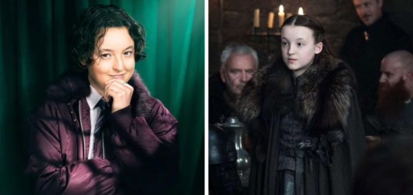
I’ve just realised that three cast members from Celebrity Traitors were in Game of Thrones

Having flashbacks to Bella Ramsey being crushed by a giant
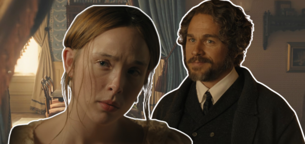


23 to 70: The ages of the Celebrity Traitors 2026 cast, from youngest to oldest

There’s a huge age range this year
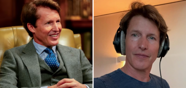
James Blunt was a British Army captain before becoming a singer and joining Celebrity Traitors
He mentioned it on the show

Monster director finally admits why they forced Aileen Wuornos in a show about Lizzie Borden
Despite the name, Lizzie Borden is not the focus of the story
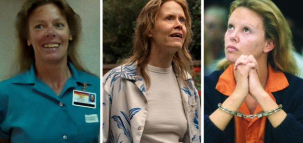
Shows and films you can watch about Aileen Wuornos, where she isn’t thrown into another story

Others tell her entire case, unlike Monster on Netflix

This viral tool lets you customise your Apple Pay cards, and here’s how to do it
You can personalise the entire design

James Acaster could be the Celebrity Traitors’ recruit, as filming reportedly paused for him
It’s not much of a cliffhanger
The ridiculous fortunes of The Celebrity Traitors: Their net worths, from £500K to £50 million
One of them could legit buy the castle three times over

The Celebrity Traitors rules explained, as Richard E Grant immediately let slip he’s a Traitor
There’s actually a slightly confusing loophole