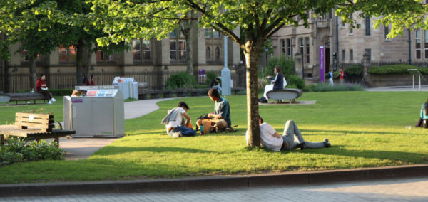
Bowland College announces new college logo to come into effect by the new academic year
The new logo will be replacing the current logo of ‘The Bowland Lady’

Bowland College has announced that it will be taking on a new logo.
In an email sent to Bowland students, the college professed its hopes to have the new logo fully integrated by the new academic year, as it will be “gradually” incorporated over the coming months.
The new logo has been developed to provide a logo that all members of the college can “identify with”. The logo takes the form of a red bow and arrow, shaped like a B and a bird, with a circle enclosing it.
The college states that the logo represents a B for Bowland, a bow and arrow to retain the link to the Bowland Lady, a bird to represent the Forest of Bowland, and a circle to symbolise unity.

Bowland College has assured its members that although the “Bowland Lady” will no longer be the main logo, she will still remain prevalent on the Founders Shield and the large tapestry that stands in the foyer. The Bowland Lady Magazine will also be keeping its name.
The email, sent out to the college’s members, states: “Over the last 12 months we have worked with our student representatives and staff, conducted a survey, carried out two workshops and collaborated with a design company to capture emerging themes and translate these into a modern image that retains the history of the college.”
It continues: “As we move forward with our new logo, we hope it provides a positive symbol for all, and is a reflection of our commitment to our College Values of Empowerment, Pride, Inclusive and Community, together we are EPIC.”
Related articles recommended by this writer:
Latest


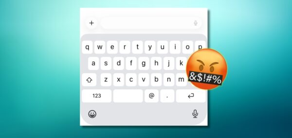
Right, here’s how to fix your iPhone keyboard if it’s glitching and making loads of typos

It’s been happening for months
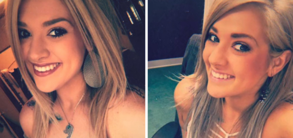
Taylor Parker’s prison call with daughter reveals first glimpse into her kids’ lives after arrest

Her mum has custody of daughter, and her ex-husband has custody of son
So Bonnie Blue *is* actually pregnant – and now the three possible dads are speaking out

‘She told me there’s a high chance I’m the dad’
Ranked: 15 Russell Group unis by THE sustainability 2026 – Manchester leads, York scores lowest
Manchester topped 1,646 universities globally in the Times Higher Education sustainability rankings
Bonnie Blue drops deranged pregnancy update, says her vile golden baby shower made ‘bump grow’

Don’t read this after eating
Drug used to delay type one diabetes approved for NHS use in Birmingham

Tepilzumab has just been approved by NICE following an early access scheme for first time use in Birmingham
‘I wake up and remember I don’t have feet’: Cardiff grad on life as a quadruple amputee

Lily lost all four of her limbs after contracting meningococcal septicaemia last year

Mum of TikToker facing Dubai death penalty recalls night daughter allegedly killed boyfriend
‘I have never seen my daughter so frightened in my life’
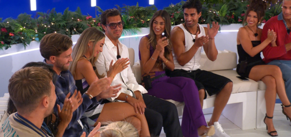
‘It’s boring’: What filming for Casa Amor is *really* like, from an Islander who was there
There are different rules for Islanders during this part of the show

‘I’m bleeding’: Protesting influencer speaks out after being ‘nearly murdered’ at BET Awards
He got out of prison last week
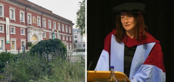
New vice-chancellor appointed at Goldsmiths as university battles financial crisis

Joanna Newman, the current deputy vice-chancellor at SOAS, will take up the post in September
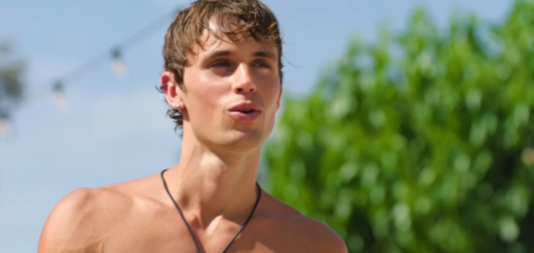
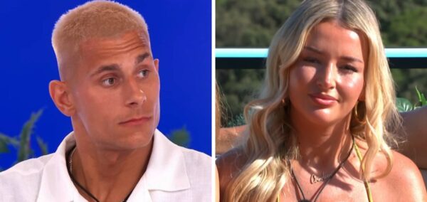
The full and dark story behind why Gabriel was axed from Love Island and won’t return
He appeared last night, but won’t be back
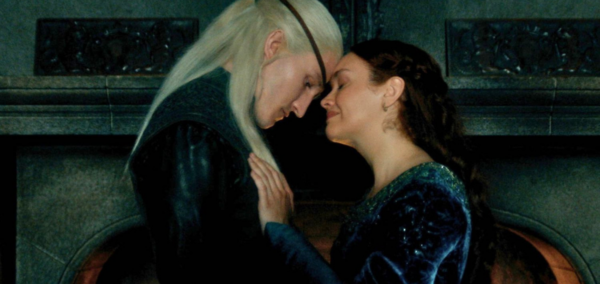
House of the Dragon stars and creator explain the shocking incest scene as people left horrified
They also revealed what it actually meant
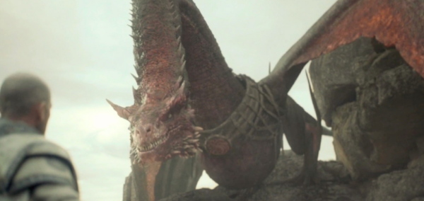
I didn’t know the sad reason Caraxes looks so different to other dragons in House of the Dragon
Why am I crying over a dragon?
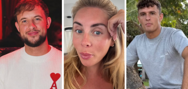
Breaking: Another Islander has been REMOVED from the Love Island 2026 villa
A ‘situation in his past’ has come to light
MPs for Lancaster and Morecambe respond to Sir Keir Starmer’s resignation
The Labour MPs have expressed their opinions on Sir Keir Starmer’s resignation and time as Prime Minister

Move aside World Cup players, the richest 2026 WAGs are in a league of their own
Meet the new Victoria Beckhams of the World Cup