It’s done on purpose! The clever reason Wicked: For Good uses ‘washed out’ colour grading
People are dragging the ugly colours once again
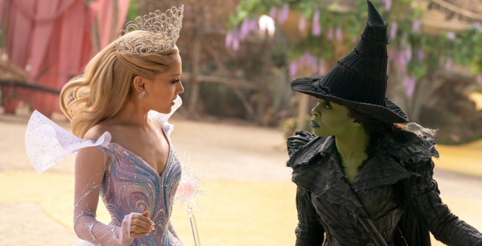
Wicked: For Good has finally released in cinemas and like with the first Wicked film, people are really annoyed about the colour grading all over again.
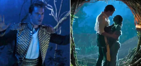
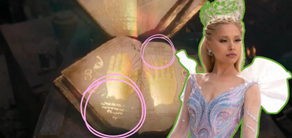
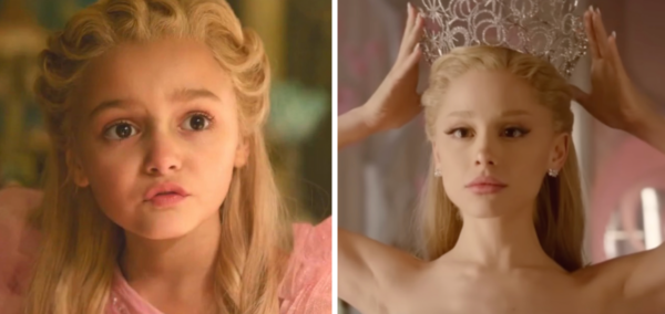
The film looks really unsaturated and washed out, and many have been editing clips themselves to show what each scene should look like.
“Wicked’s colour grading is upsetting me, is it that hard to make it a little more vibrant,” one person wrote on X.
Another said: “Whoever did the colour grading for Wicked deserves a war crime tribunal. It’s the most washed out ugly backlit mess.”
Colourful places like the Emerald City and Munchinland just look a bit flat and boring – but there is actually a very good reason why it’s like that.
A quick re-grade of WICKED reveals a vibrant and beautiful film hidden under all that sludge. pic.twitter.com/ASmrYnlqMD
— patrick. (@imPatrickT) November 23, 2024
The movie’s director Jon M. Chu has hit back at the criticism, explaining that they made the decision on purpose to make Oz feel more real.
“I mean, there’s colour all over it. I think what we wanted to do was immerse people into Oz, to make it a real place,” he told The Globe And Mail.
“Because if it was a fake place, if it was a dream in someone’s mind, then the real relationships and the stakes that these two girls are going through wouldn’t feel real.”
I've always wanted more vibrant greens in One Short Day in Wicked, so I've been fixing it myself 🥰 pic.twitter.com/NJ6W2Da5BL
— Caitlin The Chronicler (@thecaitsith_) November 23, 2025
He said they wanted to present Oz in a way that hasn’t been experienced before.
“It’s been a matte painting. It’s been a video game digital world. But for us, I want to feel the dirt. I want to feel the wear and tear of it. And that means it’s not plastic.”
Chu said the colours get more vibrant as you get further into the film, and that was done to represent a certain character’s progression.
“The contrast goes up over time because that is what Elphaba brings to this world,” he revealed.
So much thought has been put into every aspect of the musical adaptation, and no decision was made lightly, so everyone can stop dragging it now.
For more like this and for the latest memes, quizzes, updates and general pop culture chaos – like The Tab on Facebook.
Featured image by: Universal Pictures/YouTube


