

The Joke's On SUSU: Students Disheartened with April Fool's Prank
There are regular April Fool’s jokers (anyone used the new Hasselhoff Photobomb tool from Google?), there are the old classics (like the famous Spaghetti Harvest BBC piece), and then there are […]
There are regular April Fool’s jokers (anyone used the new Hasselhoff Photobomb tool from Google?), there are the old classics (like the famous Spaghetti Harvest BBC piece), and then there are some “pranks” about as funny as stubbing your toe that will forever be remembered for failing spectacularly.
It seems that this year SUSU was aiming for door number three.
As this Facebook post illustrates, frustrations mounted when some students discovered that the joke that the Union pulled this year involved choosing obnoxiously bright clashing font colours for their website.

The SUSU website was temporarily edited this morning to feature a plethora of clashing colours as part of an April Fool’s joke
This isn’t exactly worthy of Candid Camera, and it would be boring enough if it weren’t for the fact that some combinations like green-on-orange made the site all but unreadable to the few students with vision problems or colour blindness.
So that’s a double win for SUSU! Not only did someone maintaining the site actually think that changing font colours would genuinely be considered funny, but they also alienated a small portion of the student body by doing so…Result!
The site quickly reverted back to its original palette, and we were left with the more amusing prospect of a canine companion for SUSU the cat.
Lighthearted April Fool or alienation of visually impaired students? Let us know in comments.

Southampton University bans Stanley cups in lectures after damage caused by leakages
Students carrying the cups will be asked to leave them outside lecture halls inside a ‘Stanley holding pen’

Russell Group student stalked lecturer and booked registry office for their imaginary wedding
He also printed out pictures of her six year old son and called himself her ‘husband’ and ‘dear slave’


The Soton Tab is looking for new writers and we want you!
We’re hosting an open meeting on Thursday 23rd March at 4pm over Zoom

Get your diaries out: These are all the upcoming Southampton Uni strike dates in one place
Staff are going on strike for 18 days in the next two months

Southampton Uni fire which saw students evacuated from the area was caused by a ‘chiller unit’
Smoke spread across three floors of the uni building

Southampton Uni promises to read out grads’ names and shake their hand at graduation
Students resorted to shaking each other’s hands in the summer ceremonies at St Mary’s


Confirmed: Southampton Uni staff are going on strike for three days this month
The UCU say strikes could continue in the new year as well as a potential marking boycott

Sustainable queens: Southampton officially 18th best in UK according to new uni rankings
And no it’s not because of the city’s rats

Applications for The Soton Tab’s editorial team are now OPEN
We’re recruiting for Editor in Chief, News Editor, Features Editor and Social Media / TikTok Editor

Southampton is officially 12th best university in UK, according to new World Rankings
But do any of the other unis have Manzil’s though?

Freshers living in hotels after burst pipe ‘floods’ Unite Students accommodation
Videos show water gushing from the ceiling and down corridors

As a 2020 grad, I waited two years for my graduation ceremony – and it was a car crash
I love waiting for two years to not even have my name called out on stage x

A Russell Group uni isn’t reading out its grads’ names at graduation ceremonies this week
And the grads aren’t even getting a handshake on stage!!
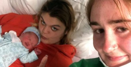
Southampton student gives birth on the toilet without knowing she was pregnant
Jess Davis thought she was just experiencing period pain

Everything Jack O’Connell has been up to since breaking all our hearts as Cook in Skins
He’s now starring in the new Amy Winehouse biopic Back To Black

From absolute legends to losers, the definitive ranking of Coachella’s biggest headliners
There’s been the best of shows, there’s been the worst of shows


Tori has finally spilled what her friendship status is now with the other MAFS Australia girls
‘What those girls did to me was not friendship’


Madeleine complains that her MAFS Australia edit made her look like a ‘batsh*t crazy b*tch’
The psychic medium said that producers ‘pushed on a relationship topic that she didn’t want to go into’

MAFS Australia bride says groom broke up with her ‘out of the blue’ and won’t reply to her
‘He won’t reply to me. He hasn’t replied’

A body language expert says Jack and Tori are lying about having sex on MAFS Australia
‘Do I think they had proper sex? No’

Everything Eden and Jayden have been up to since their messy run on MAFS Australia
Apparently they broke up FOUR TIMES after filming finished

This is why everyone thinks Taylor Swift’s song thanK you aIMee is about Kim Kardashian
The title literally spells out KIM!!

All the savage Matty Healy lyrics Taylor Swift sings on The Tortured Poets Department
‘They shake their heads and say God help her when I tell them he’s my man’

Richard Gadd speaks about how similar Baby Reindeer’s Martha actually is to his real stalker
She did actually send him over 41,071 emails and leave 350 hours of voicemails

Student at £43,000 a year private school ‘smashed the skulls’ of two students with hammer
The 17-year-old also tried to kill a teacher in ‘horrific attack’


What have Timothy and Lucinda been up to since their MAFS Australia 2024 homestay fight?
They’re still besties!

Here’s where to watch Richard Gadd next if you’re obsessed with Netflix’s Baby Reindeer
He’s in a police show with Stephen Graham!

Digs at Davide to Lorraine Kelly drama: What Ekin-Su has been up to since Celeb Big Brother
She’s been in the headlines a lot lately


After their tense homestay, are Jack and Tori still together after MAFS Australia 2024?
I need answers immediately

Yikes! A snippet of Taylor Swift’s new album has allegedly leaked and people are SLATING it
‘We declared Charlie Puth should be a bigger artist’ is an actual lyric

Inside the life of Walton Goggins, the Fallout ghoul everyone is weirdly crushing on
Yes, it’s possible to thirst after a man who looks like a carved pumpkin