

Your SUSU, My SUSU, Who's SUSU???
SUSU re-branding – really necessary?
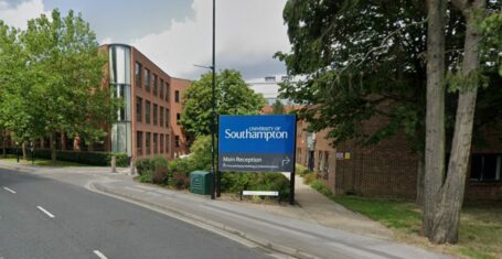
As the dust settles after Fresher’s fortnight it is finally possible to look at SUSU’s expensive re-branding project which has taken place over the summer.
I would be the first to admit that prior to the summer break the Union had started to look a bit tired, with some battered pool tables and a foyer that looked as though it had been chucked together by a student with a university deadline and they’d only remembered when they got in from Jesters at 2am.
It does look very swish and modern
The new foyer actually looks very spectacular, the glass rooms, new chairs and large video wall look modern and vibrant, exactly the look the university demands. As well as some snappy signs adorning the concourse all looks good. Be that as it may, wander behind the facade and much of the union is unchanged. Large areas of the corridor look like they haven’t even seen a coat of paint in a few years let alone an expensive revamp!!!
However, of potentially more worrying concern isn’t the physical redecoration. Now I don’t know about you but in my four years at university I have never had an issue at all with any of the names used. SUSU, Stag’s Head, SUSU Shop and Boiler House are all names which anyone within the university could instantly recognise and identify.
Is it really THAT hard to understand?
Charlotte Woods (2010/2011 Communications Sabb) felt that these weren’t identifiable enough and needed changing, along with the SUSU logo as ‘people didn’t realise it spelt SUSU….’ Unfortunately rather than simply making the brand identifiable with the union it was decided to completely change the brand, rather than the product.
On her blog she said that students were consulted. I don’t remember said consultation. Making a decision based on the opinion of 700 students out of 25000 is not a fair view when it is our money which is being spent, especially as it seems the results said nothing about there being a NEED for a re-brand, just that people don’t interact like they should.
The new logo looks like something that was created in about half an hour on clip art. The old logo may have been a little difficult to identify but at least it was unique and quirky. This logo looks like any logo for any small business anywhere in the world, which I feel is a disappointment for a university that prides itself at being the top of its game for so many degree areas as well as horrifically clichéd.
And this is better because?
Nonetheless the most infuriating area is that of the names. Our union is no longer just plain simple SUSU, it is now Your SUSU, or is that my SUSU? It’s hard to get the context right when I’m a member as well! Why the need to change the name of the union – no-one is ever going to refer to it as anything other then SUSU!!!
Possibly more upsetting is the renaming of the JCR Bars. Names universally recognised such as Boiler house, Glen Bar and Connaught Bar are gone to the ether, replaced by bland boring names such as Bar Monte. This in turn takes away so much of the uniqueness and history that existed in the Halls. Changing the names just adds to the appearance that the SUSU is only bothered about skin deep appearances and has changed the names of bars for no apparent reason other than to make the package as a whole look more professional and corporate, a change which wasn’t required in the least.
Also unrequired was the naming of the central SUSU building as ‘The Union’, because obviously referring to it as SUSU is no longer enough, and the Stags Head now being ‘The Stags’. Although it is the common term used to refer to the pub, in my eyes it doesn’t quite work!!!!
I will fully admit that the Student Union needed a redecorate; it was starting to look tired and faded. The new work is fantastic and praise must be duly given to those who designed and commissioned the work. Nonetheless the money spent on the re-branding, the logos and names of areas around the site, was a pointless and unnecessary expense.
In a time when fees are about to rise to £9000 a year and rent and bills are rising for students surely there are many many ways in which the money could have been better spent then on what seems to be a vanity project for several of the previous Sabbs, because I can see no reason why anything has changed with respect to the reasons for the attempted re-brand other than some fancy signs and general confusion.

Southampton University bans Stanley cups in lectures after damage caused by leakages
Students carrying the cups will be asked to leave them outside lecture halls inside a ‘Stanley holding pen’

Russell Group student stalked lecturer and booked registry office for their imaginary wedding
He also printed out pictures of her six year old son and called himself her ‘husband’ and ‘dear slave’


The Soton Tab is looking for new writers and we want you!
We’re hosting an open meeting on Thursday 23rd March at 4pm over Zoom

Get your diaries out: These are all the upcoming Southampton Uni strike dates in one place
Staff are going on strike for 18 days in the next two months

Southampton Uni fire which saw students evacuated from the area was caused by a ‘chiller unit’
Smoke spread across three floors of the uni building

Southampton Uni promises to read out grads’ names and shake their hand at graduation
Students resorted to shaking each other’s hands in the summer ceremonies at St Mary’s


Confirmed: Southampton Uni staff are going on strike for three days this month
The UCU say strikes could continue in the new year as well as a potential marking boycott

Sustainable queens: Southampton officially 18th best in UK according to new uni rankings
And no it’s not because of the city’s rats

Applications for The Soton Tab’s editorial team are now OPEN
We’re recruiting for Editor in Chief, News Editor, Features Editor and Social Media / TikTok Editor

Southampton is officially 12th best university in UK, according to new World Rankings
But do any of the other unis have Manzil’s though?

Freshers living in hotels after burst pipe ‘floods’ Unite Students accommodation
Videos show water gushing from the ceiling and down corridors

As a 2020 grad, I waited two years for my graduation ceremony – and it was a car crash
I love waiting for two years to not even have my name called out on stage x

A Russell Group uni isn’t reading out its grads’ names at graduation ceremonies this week
And the grads aren’t even getting a handshake on stage!!

Southampton student gives birth on the toilet without knowing she was pregnant
Jess Davis thought she was just experiencing period pain

Everything Jack O’Connell has been up to since breaking all our hearts as Cook in Skins
He’s now starring in the new Amy Winehouse biopic Back To Black

From absolute legends to losers, the definitive ranking of Coachella’s biggest headliners
There’s been the best of shows, there’s been the worst of shows


Tori has finally spilled what her friendship status is now with the other MAFS Australia girls
‘What those girls did to me was not friendship’


Madeleine complains that her MAFS Australia edit made her look like a ‘batsh*t crazy b*tch’
The psychic medium said that producers ‘pushed on a relationship topic that she didn’t want to go into’

MAFS Australia bride says groom broke up with her ‘out of the blue’ and won’t reply to her
‘He won’t reply to me. He hasn’t replied’

A body language expert says Jack and Tori are lying about having sex on MAFS Australia
‘Do I think they had proper sex? No’

Everything Eden and Jayden have been up to since their messy run on MAFS Australia
Apparently they broke up FOUR TIMES after filming finished

This is why everyone thinks Taylor Swift’s song thanK you aIMee is about Kim Kardashian
The title literally spells out KIM!!

All the savage Matty Healy lyrics Taylor Swift sings on The Tortured Poets Department
‘They shake their heads and say God help her when I tell them he’s my man’

Richard Gadd speaks about how similar Baby Reindeer’s Martha actually is to his real stalker
She did actually send him over 41,071 emails and leave 350 hours of voicemails

Student at £43,000 a year private school ‘smashed the skulls’ of two students with hammer
The 17-year-old also tried to kill a teacher in ‘horrific attack’


What have Timothy and Lucinda been up to since their MAFS Australia 2024 homestay fight?
They’re still besties!

Here’s where to watch Richard Gadd next if you’re obsessed with Netflix’s Baby Reindeer
He’s in a police show with Stephen Graham!

Digs at Davide to Lorraine Kelly drama: What Ekin-Su has been up to since Celeb Big Brother
She’s been in the headlines a lot lately


After their tense homestay, are Jack and Tori still together after MAFS Australia 2024?
I need answers immediately

Yikes! A snippet of Taylor Swift’s new album has allegedly leaked and people are SLATING it
‘We declared Charlie Puth should be a bigger artist’ is an actual lyric

Inside the life of Walton Goggins, the Fallout ghoul everyone is weirdly crushing on
Yes, it’s possible to thirst after a man who looks like a carved pumpkin